Noughts and Crosses book cover design by Archie Durrant
Editorial Design

Noughts & Crosses

Role Book Cover Designer
Category Editorial Design
Year 2024

Overview

Noughts & Crosses by Malorie Blackman delves into the complex and often painful realities of racial division and social inequality through the intertwined lives of its characters, Callum and Sephy.

This book cover design project explores visual storytelling through symbolic elements, creating a design that communicates the book's urgent themes of love, conflict, and resistance.

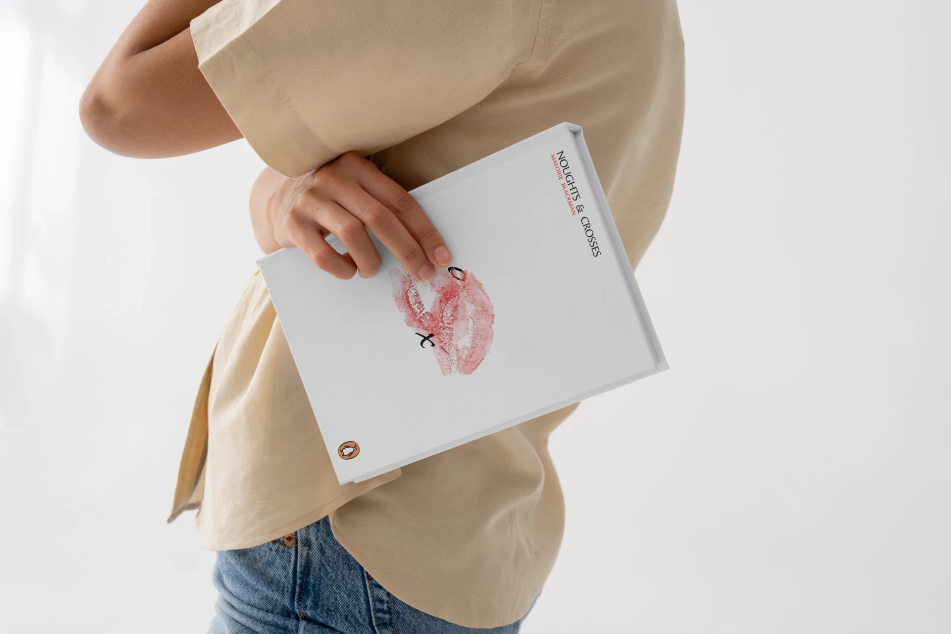
Noughts and Crosses cover design
Noughts and Crosses typography detail

Visual Storytelling

The cover's bold design, featuring crosses and noughts in striking black and white, evokes both the violence that permeates the world of the book and the passionate connections between characters. The stark white space offers a moment of breath and hope amid the conflict.

Echoes of African-inspired visuals provide crucial context to the alternate-history setting. This world, where the Aprican Empire colonized Europe 700 years earlier, inspires parallels between class structure and systemic inequality in modern society.

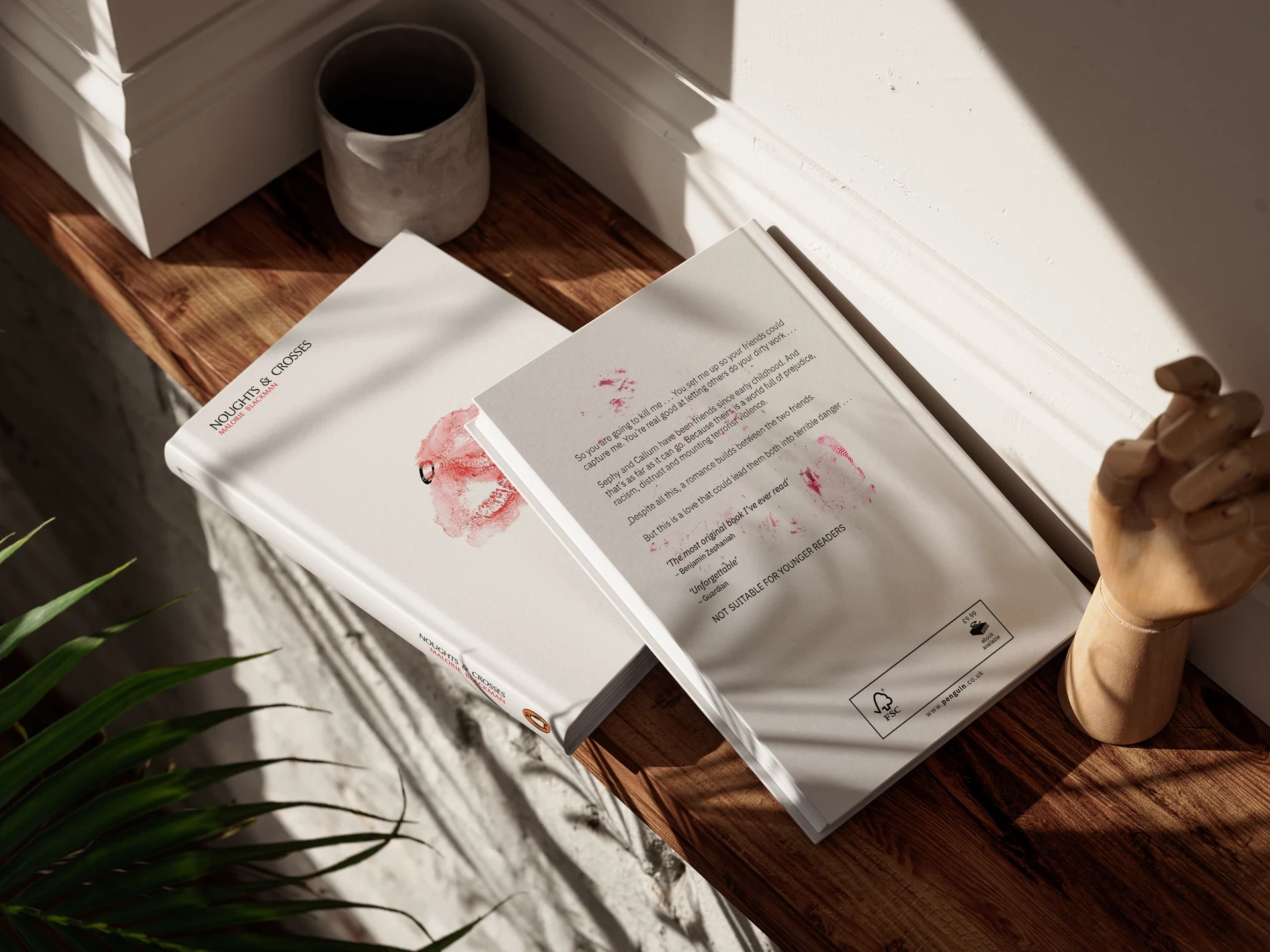
Book cover in context

Symbolic Elements

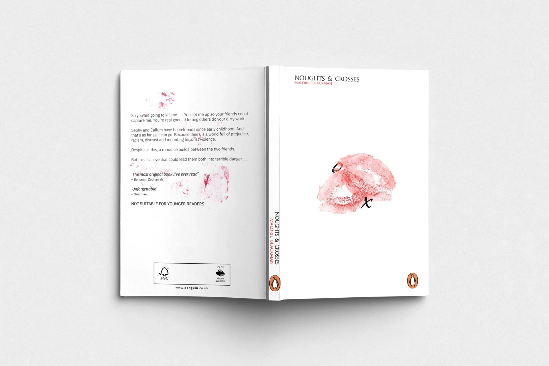
The overlapping lipstick marks on the cover serve as a poignant symbol of intimacy and tension - two lives, Callum and Sephy, pressed close yet marked by struggle. These imprints visually represent the fraught romance at the center of the story, embodying love that persists despite harsh societal divisions.

Subtle textures such as fingerprints and faint blood stains woven around the text add layers of meaning, suggesting identity, violence, and the human cost behind the political conflict depicted in the story.

Final design
Typography close-up

Typography & Craft

This minimalistic approach avoids literal illustration in favor of symbolic elements, allowing the reader to immerse themselves in Blackman's groundbreaking work. The cover's restrained palette and striking imagery work together to communicate the urgent and relevant themes.

Choosing fonts that suggest both vulnerability and strength ensures the cover communicates an emotional depth that resonates with readers. The textured paper binding featured in premium editions offers tactile depth, reinforcing notions of identity and history through physical interaction.